Photoshop has a number of Filters built into it which can be used in various ways. The permutations and combinations are limitless. Let me show you some of the filters.
Step 1 : Open a new white layer in Photoshop.
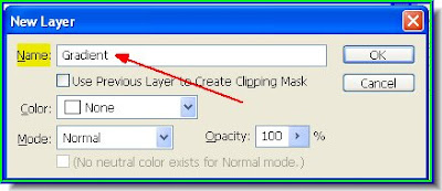
Step 2 : Press CTRl+SHIFT+N to make a new layer. I have named it Gradient. Naming layers is good practice, especially when you a working on a number of them. Otherwise it becomes confusing what is on which layer. Click ok.
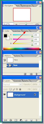
 Step 3 : Look in the Layers/Channels/Paths pallete. The layer called Gradient has formed.
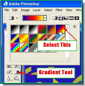
 Step 4 : Click the Gradient Tool. You will find the Gradient Editor in the top panel. Click directly on the Gradient Editor (where the red arrow points to).
 Step 5 : The Gradient Editor opens. You can see the available Presets. You can make your own Gradient too.
 Step 6 : I have clicked on one of the Gradients.
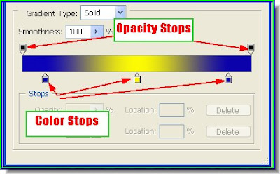
Step 7 : You can see the Color stops at the bottom and the Opacity Stops at the stop. I will show how they are used to create a new Gradient.
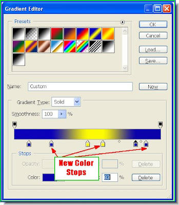
Step 8 : Press ALT and click on a Color Stop. This will create a duplicate color stop. I have created new blue and yellow color stops. Compare it to Step 7.
 Step 9 : I have rearranged them by dragging the blue and yellow stops. You can make more duplications if you want.
 Step 10 : I have now clicked on the Opacity stop. I have also reduced the opacity by dragging on the slider. See above. Click ok.
 Step 11 : Now click on the second icon. It is the Radial Gradient. The first, Linear, is on by default.
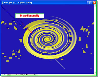
 Step 12 : With the Radial Gradient selected drag from somewhere in the middle towards the top, but not to the top.
 Step 13 : This is the effect.
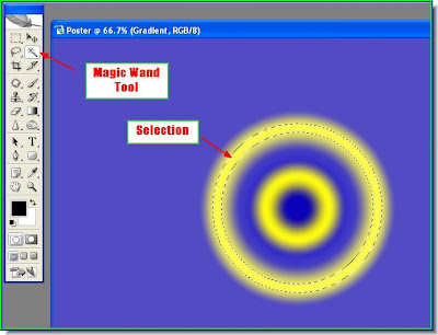
Step 14 : Click on the Magic Wand Tool from the left panel at the top. And click on the yellow portion. A selection will form immediately as shown above.
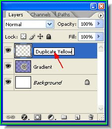
Step 15 : Press CTRL+J. This will copy and paste the selection to a new layer. Click where shown and a small white rectangle will open where you can rename the layer. I have named it Duplicate Yellow. After renaming click one. And the layer will be renamed.
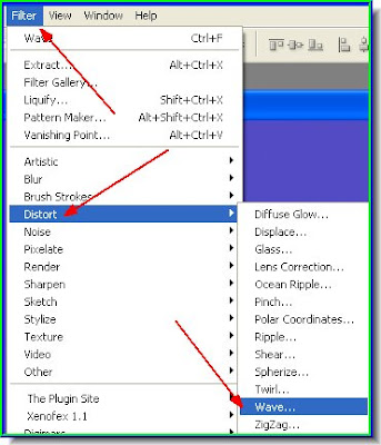
Step 16 : Go to Filter>Distort>Wave
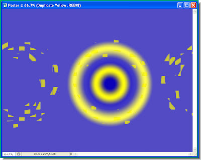
 Step 17 : The Wave dialogue box opens. Change the Number of Generators to 200. Set the Type as Square. Set the Amplitude and Wavelength as shown and lastly choose Wrap Around for Undefined areas. Click ok.
 Step 18 : Go to Filter again. You will find the last filter i.e. Wave at the top and click on it.
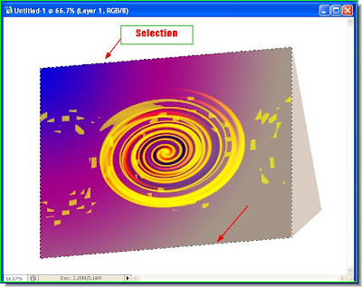
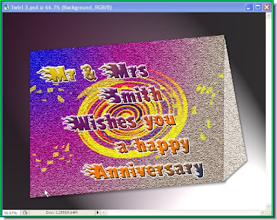
Step 19 : This is how the poster looks like.
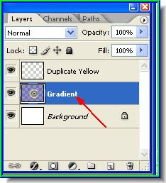
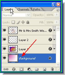
Step 20 : Now click back on the layer marked Gradient to select it. A selected layer is always highlighted.
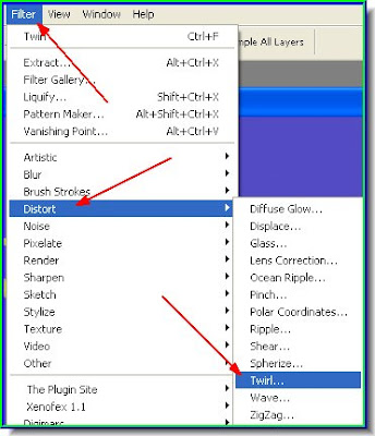
 Step 21 : Go to Filter>Distort>Twirl.
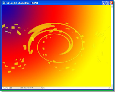
 Step 22 : When the Twirl dialogue box opens drag the Angle slider to the extreme right. Click ok.
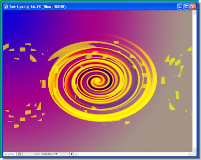
 Step 23 : This is how the poster now looks.
 Step 24 : Now click on the Magic Wand and click on the Yellow. A selection forms. Press CTRL+J and the selection will be copied and pasted into a new layer.
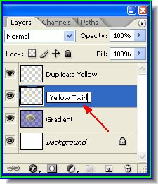
Step 25 : I am naming the new Layer Yellow Twirl.
Step 26 : Now go down to the Gradient layer below and apply the Twirl Filter again.
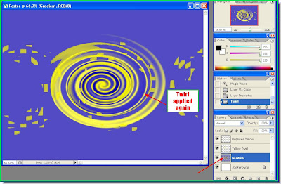
Step 27 : The Twirl filter reapplied to the Gradient Layer.
 Step 28 : Now while in the Gradient layer apply the Magic wand to the blue portion. The blue will be selected. Press CTRL+J which will copy and paste the selection to a new layer which I will name Blue.
 Step 29 : The Blue layer. You have to double click where the hand points to to rename it.
Step 30 : Click the Gradient Tool and from the Gradient Editor select the gradient as shown. It is the same that I used earlier.
Step 31 : Drag with the Gradient Tool diagonally from top as shown.
Step 32 : The Gradient has been applied to the 'Blue' Layer.
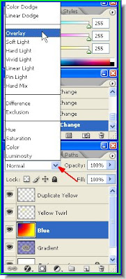
Step 33 : In the Layers/Channels/Paths pallette, change the blend mode to Overlay as shown from the pop up window.
Step 34 : This is the effect you get.
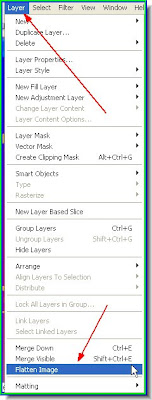
Step 35 : Go to Layer>Flatten Layer
 Step 36 : The layers have been flattened. Keep it aside.
 Step 37 : Open a new white layer
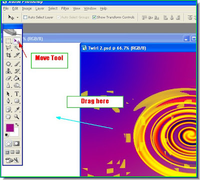
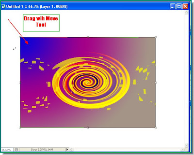
Step 38 : Keep the SHIFT key pressed drag the poster onto the new white layer with the Move Tool.
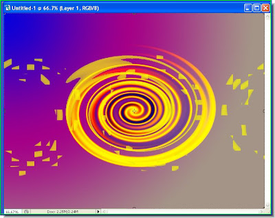
Step 39 : The poster covers the new white layer entirely.
Step 40 : Use the Move Tool to drag down a corner of the Image. Then press ALT and drag to resize proportionately.

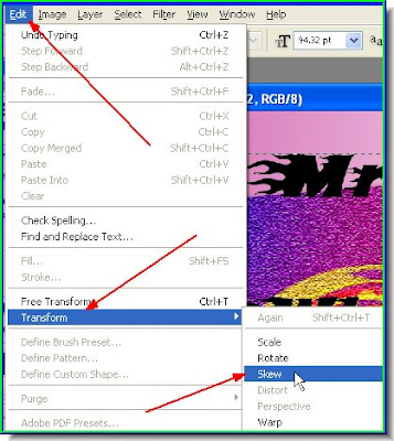
Step 41 : Go to Edit>Transform>Skew.
 Step 42 : Press the ALT key and push up the right corner with the Move Tool.
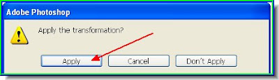
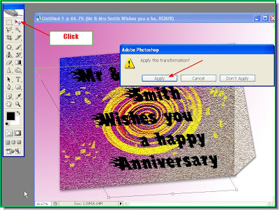
Step 43 : Click on the Move Tool or any other tool and this dialogue box will appear. Click Apply.
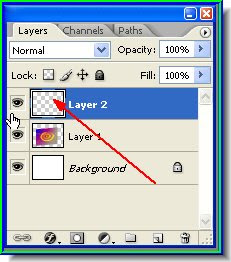
Step 44 : Press CTRL+ALT+N to form a new layer. You can see the new layer in the Laters/Channels/Paths pallette. The New Layer is at the top. The poster is in the layer below it and the white layer is the Background.
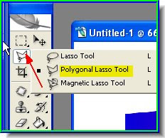
Step 45 : Now click the Polygon Lasso Tool to select it.
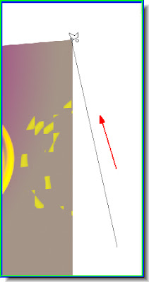
Step 46 : with the Polygon Lasso select draw a straight line to the top as shown.
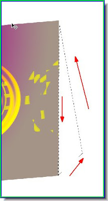
Step 47 : Click from bottom to top, along the sides and then back to the starting point and you will have your selection.
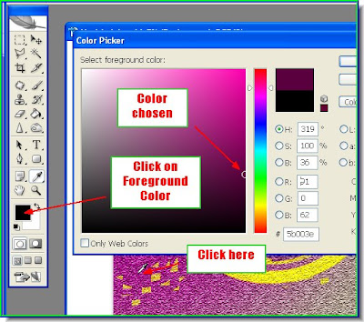
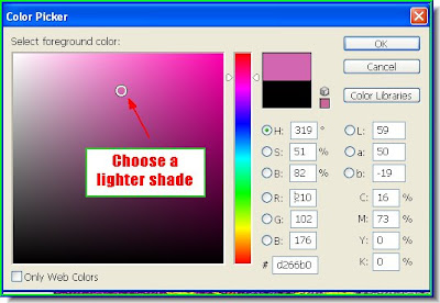
 Step 48 : Click on the Foreground Color. This will bring up the Color Picker. USe the cursor to click where I have done. The cursor changes to an eyedropper. The selected color is shown on top. Choose a lighter shade and click on it. Click ok in the Color Picker.


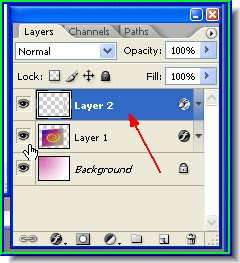
Step 49 : Use the Paint Bucket to fill the selection with the color. Note that it is slightly lighter. Click CTRL+D to get rid of the selection.
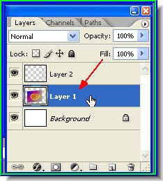
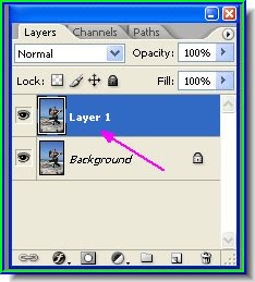
Step 50 : Now click on Layer 1 to select it.
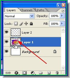
Step 51 : CTRL+Click on the layer thumbnail of Layer 1.
Step 52 : The poster layer has been selected. You can see the selection lines all around the edges.
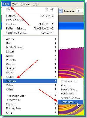
Step 53 : Go to Filter>Texture>Texturiser.
 Step 54 : The Texturiser dialogue box opens.
 Step 55 : From the drop down box I have chosen Sandstone. You can select one of the other options too.
 Step 56 : Twiddle with the Scaling and Relief sliders. You can also change the Light to determine its direction. Click ok.
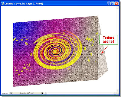
 Step 57 : The Texture has been applied. Press CTRL+D to deselect.
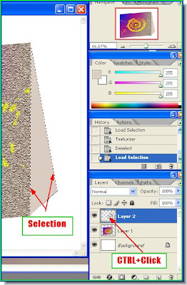
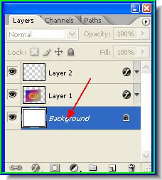
 Step 58 : Click back on Layer 2. This is where the selection at the side has been made.
Step 59 : CTRL+Click on the Layer thumbnail of Layer 2 and the side will be selected.
Step 60 : Now go to Filter>Texture Texturiser and again apply the Texture filter as in Steps 53 to 57.
 Step 61 : Click on Layer 1 again to select it.
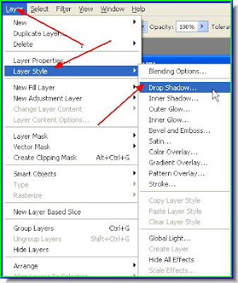
Step 62 : Go to Layer>Layer Style>Drop Shadow.
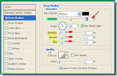
Step 63 : The Drop Shadow Layer Style dialogue box opens. Drag the Distance, Size and Spread sliders only a little. See the effect that it has on your image. Lastly drag the Opacity slider down to 50 %. Click ok.
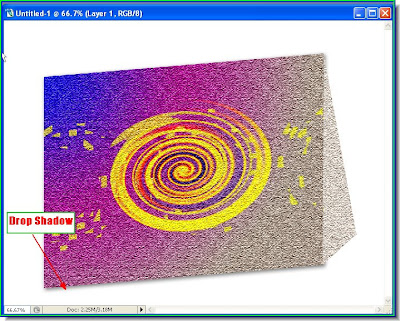
Step 64 : The Drop Shadow has been added to the front. It has to be added to the side as well.
 Step 65 : Click back on Layer 2 to select it. Then apply a drop shadow to the side similarly.
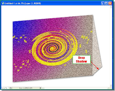
Step 66 : The Drop shadow has been added to the side.
Step 67 : Now click on the Background. The white layer that I opened.
Step 68 : Click on the Foreground Color. It will bring up the Color Picker. Click with the cursor, which changes into an eyedropper. You will be able to see the selected color in the top box.
Step 69 : Click on a lighter shade. Click ok in the Color Picker.
 Step 70 : Click on the Gradient Tool and select the Gradient shown on top from the drop down window.
 Step 71 : Drag diagonally with the Gradient Tool from the top.
 Step 72 : The gradient has been added.
 Step 73 : Click the Type Tool, then the Horizontal Type Tool.
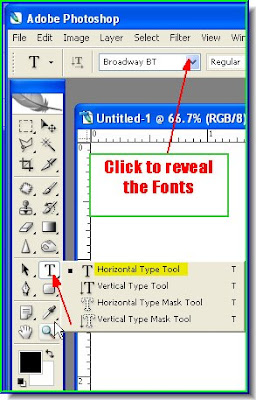
 Step 74 : Click on top where shown and the list of fonts available is shown. Click on one.
Step 75 : In the Layers/Channels/Paths pallette click on the top most layer, before using the Text Tool.
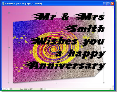
Step 76 : The text has been added.
Step 78 : Go to Edit>Transform>Skew. Press Alt on the keyboard to resize.
 Step 79 : Now go to Edit>Transform>Scale. Press ALT on the ketboard to resize. Use these commands to resize the lettering.
Step 80 : The letters have been resized. Click on the Move Tool or any other tool to apply the transformsation. As soon as you click the Apply Transformation dialogue Box opens. Click apply.
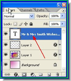
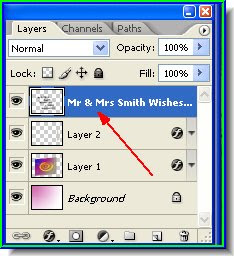
Step 81 : Look at the Layers/Channels/Paths pallette. The Type Layer is at the top.
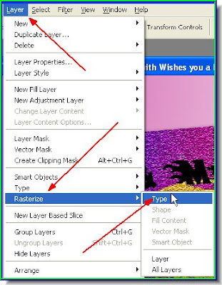
Step 82 : Go to Type>Rasterise>Type.
Step 83 : Now look at the Type Layer. It has been rasterised. A Type layer cannot be edited. It can be edited only after it is Rasterised.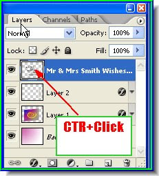
Step 84 : CTRL+Click the layer thumbnail of the Type layer to make a selection of the letters.
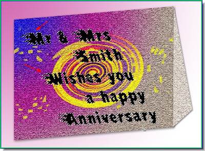
Step 85 : The letters have been selected. Now apply any Gradient or Color to it.
Step 86 : The Gradient has been added. Press CTRL+D to deselect.
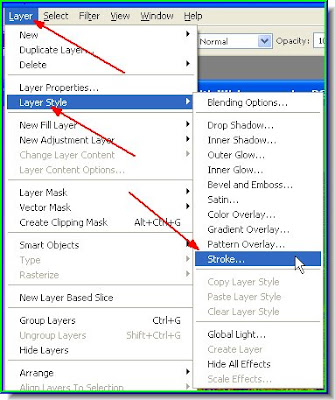
Step 87 : Go to Layer>Layer Style>Stroke.
 Step 88 : When the Stroke dialogue box pens at right click the color box. By default it is red. Click on it. It will open the Color Picker. Choose white on the left top corner by clicking on it. Click ok in the Color Picker and the Stroke dialogue box. I have left them at the default settings.
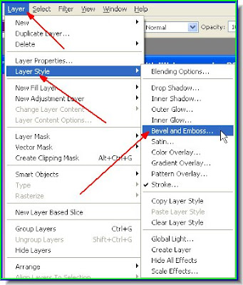
Step 89 : Go to Layer>Layer Style>Bevel & Emboss.
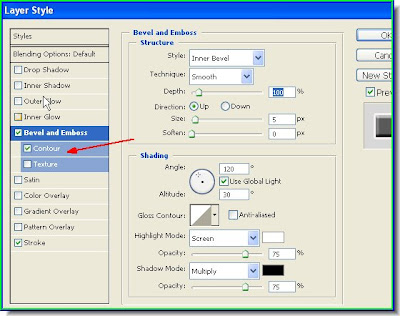
Step 90 : In the Bevel and Emboss dialogue box, just check Contour at the left marked with the red arrow. Leave the other settings unchanged.
Step 91 : Now click on the Background Layer to select it.
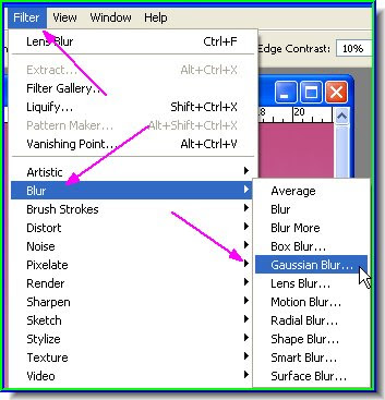
 Step 92 : Go to Filter>Render>Lighting Effects.
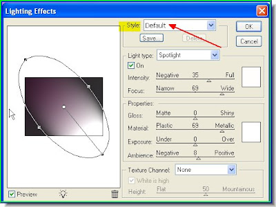
Step 93 : When the Lighting Efects dialogue box opens make sure that Default is selected. See red arrow.
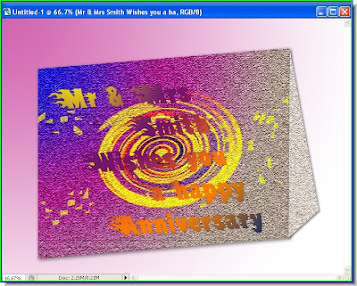
And, there is your finished poster. I have shown where some of the Filters are located in Photoshop. You can experiment on them. Never be afraid to experiment. And, you may come up with something better.
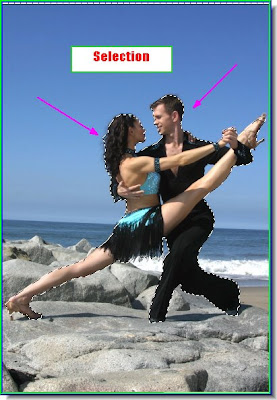
 Step 3 : Select the Magnetic Lasso Tool. I prefer using the Pen Tool. But for this tutorial let us work with the Magnetic Lasso Tool. The Magnetic Lasso tool detects and snaps to the edge of an object as you to trace along its outline.


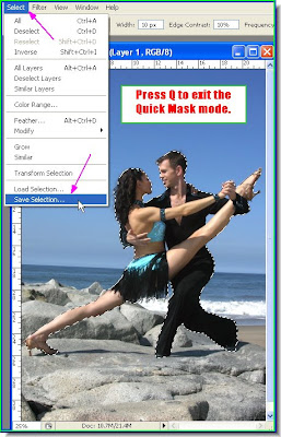
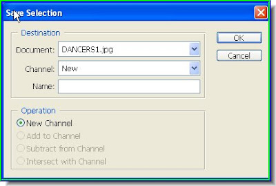 Step 11 : The Save Selection dialogue box opens. Click ok. Now press CTRL+D to deselect. The marching ants disappear.
 Step 12 : Now click on Channels in the Layers/Channels/Paths pallette and the Channels pallette opens. At the bottom you will find your selection has been saved as -- 'Alpha 1'. An alpha channel is a special type of channel used in graphics software for saving selections.


 Step 19 : Click the Layer Mask icon and a layer mask forms besides the layer thumbnail on Layer 1.


 Step 1 : The red arrow points to where the Styles are located on the right of Photoshop.
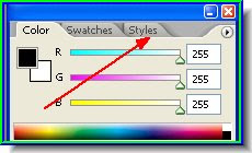
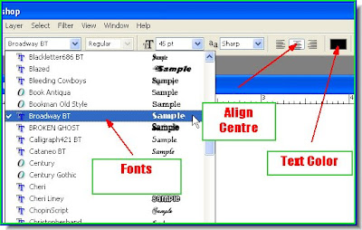 Step 3 : You can see where the Fonts are located. You can set the alignment. I have aligned it to centre. The defaul color of the text is black. You can click the box to bring up the Color picker from where you change the color if you want. I am leaving it at the default black, because when you applying Styles, the color does not matter.
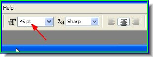 Step 4 : You set the size of the font from here. There is a dropdown box from which you set the font to a maximum of 72 points. But do not bother with it. Just set a value in the box and you will get any size of font.

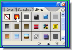 Step 7 : I have clicked on a Style.
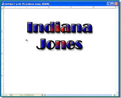 Step 8 : That is all there is to it.
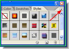 Step 9 : Notice the small black arrow where the red arrow points to. Click it.