Friday, September 30, 2011

Adjustment Layers - Desaturated Look

You can give a deliberately desaturated look to images in Photoshop, while some color still remains. It is a question of using Adjustment Layers and Blend Modes. It can be done quite easily.
This is a free stock image.
The desaturated or muted color effect.
The tutorial is here
Other photoshop tutorials are here


F'd Ad Fridays: Free design consultation

Via Buzzfeed

Looks totally legit.


And so ends a particularly effed week in advertising. Have a great weekend.

F'd Ad Fridays: Painfully effing obvious product placement

Flavorwire shared this.


No, it is not an ad. At least not in the traditional sense. It's apparently from series 5, episode 3, but I can't be bothered to slog through online transcripts.

I haven't seen that kind of in-episode shilling since Fred and Barney took a smoke break.

F'd Ad Fridays: DiscoWHAT?!?


This modest Indian take away menu from the UK has been making the rounds online this week as "the greatest typo ever". I found one reference to it that was over 2 years old (with tasteless ads). I'll have to assume they've fixed it by now. Unless, of course, it resulted in a huge increase in soon-to-be-disappointed customers.

F'd Ad Fridays: [Media] NY Times sexy chicken is weird (and done like dinner)


Mainstream print-oriented media may be fighting a losing battle, but the New York Times has taken an "if you can't beat 'em, join 'em" approach to grabbing eyeballs with the bizarre.

Dining section photo editor Tiina Loite said “My original concept was sort of a languid nude". Some compared the final shot to Burt Reynolds' Playgirl shoot (but with less hair). PETA called it "ghastly and sickly" and "necrophilia".

My reaction? "Seen it". And I hated it then.


Seriously offputting.

F'd Ad Fridays: JC Penny plays with Gen-X nostalgia, fails on more than sexism

Look, I'm a Generation X guy. I have worn out the play heads on more than one VCR pausing and doing a frame-by-frame on Phoebe Cates coming out of that swimming pool in Fast Times at Ridgemont High. So despite being a critic of gratuitous sex in advertising, this should appeal to my inner adolescent boy. So I won't even give it the sexist read this time. (Although it does go there.)


But it doesn't appeal. It totally misses on four counts:

The Adman in me says: "How stupid is that! Everyone knows you can only look one place at once. They actually made it even less likely that people will look at the shirts now!"

The Music Geek in me says: "That music is all wrong! An entire generation of men still get a chubby when they hear 'Moving in Stereo' by The Cars. You can't change the mood, man!"

The Writer in me says: "That whole sequence was a great story climax (excuse the pun) about Brad hitting bottom, going from big man on campus to a creep jerking off to his sister's friend on the toilet wearing an embarrassing uniform. Totally out of context."

And my Inner Adolescent adds, "Hey! What happened to the topless scene?!?"

This artistic censorship is an outrage!
Someone get Amy Heckerling on the phone.

F'd Ad Fridays: At Sofitel men stand and deliver, women watch

Feministe has something to say about the main image on Sofitel's consumer site.


Business@Sofitel: Men TALKING! And GESTURING! And LEADING! And women… sitting and listening! And writing down the important things that the talking, gesturing men say! And making the “I am so interested in all of the interesting things you are saying because you are just so interesting” face! And looking really pretty while they do it!

Sounds just lovely. Do pretty women who gaze adoringly at you come standard, or is there an extra cost for that? Is there a discount for uglier ones? Because I’ll totally take uglier ones as long as they can do the “interested” face.
But this is Sofitel we're talking about! It's a man's man's man's world. Seriously. The place is literally covered in semen.

Thanks to @LilMsCreant for the tip.

F'd Ad Fridays: F'd Law Association Ad

I couldn't find a non-flash version of this ad for The Association of Finnish Lawyers, which just went up on Copyranter, which is too bad because it's a little embarrassing for desktop viewing at work. (Turn down the sound and keep an eye out for passers by.)


Goodness me. And I thought it was the lawyers who kept the admen in line...

And I think I know why they misspelt "Finnish"

F'd Ad Fridays: Android Freud determines whether your son is gay

According to RFl, French Android smartphone users can download an app that will let them know if their son is gay.


It costs less than 2 Euro, and uses just 20 questions to robotically determine who your child really is:

The questions range over a variety of subjects that are supposed to indicate their son's sexual preferences. They include his attitude to personal grooming and dress sense, whether he likes football and reads sports papers and whether he likes musicals and/or divas such as Mylène Farmer.

The questionnaire also puts the parents under the spotlight.

“Are you divorced?” it asks, going on to suggest that there might be “a certain absence of the father” or, alternatively, that the progenitor might be “very authoritarian”.

While mothers whose sons are judged to be gay are told to “ACCEPT IT”, mothers of supposed heterosexuals receive a message that appears to take a much less indulgent attitude to homosexuality.

“You have nothing to worry about, your son is not gay,” it reads. “So you have a very good chance of being a grandmother with all the joys that brings.”
It's hard to count all the kinds of wrong this is, including all the stereotypes and the obsolete Freudian idea that parental conditions made people gay. (Although it should be noted that Freud was otherwise relatively progressive in his attitudes on that front.)

Not to mention the fundamental problem of assuming gayness is some kind of problem. Equality group All Out has a petition to Google to remove the app. As of this writing, it has 34.227 signatures.

F'd Ad Fridays: Soup For Sluts

Slutwalk Toronto shared this packaging on their Facebook wall:

I did a little googling, and it is real. (And, I assume, cheap, fast and easy.)

You can buy it online at Neatoshop.

F'd Ad Fridays: Rich people problems


This campaign reminds me of Hunter S. Thompson's rant about the wealthy, when he covered the Pulitzer divorce trial:


If we were "a generation away" from robots in the early 80s, then I guess these ads are just in time. Too bad there are so few rich people left in the world to appreciate them.

Via AoTW

F'd Ad Fridays: Today's PETA outrage


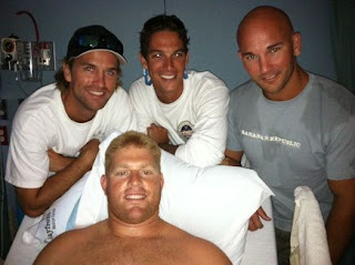
The guy in the centre of this picture is CJ Wickersham, a recreational spear fisher who wound up in the news (and in hospital) after a bull shark attacked and almost bit off his leg. Even though it was a truamatic wound, requiring had to get about 800 stitches, he said he has no hard feelings against the shark.

Wickersham is luckier than Michael Cohen, a Canadian who has lost his leg and is fighting for his life after a great white attack in South Africa.

Shark attacks do happen. They are, however, rare and any conservationist will tell you that we are a far greater threat to their species (through unsustainable fishing and horrific "finning" to serve the shark fin soup market) than they are to ours.

Nonetheless, there is absolutely no call for this:


According to AdFreak, PETA is fruitlessly attempting  to get this billboard posted in the vicinity of where the Wickersham attack took place.

Yes, this kind of asshattery gets them in the news. But it is also what polarizes people like me, who are empathetic towards animal welfare, against them. The jerks.

F'd Ad Fridays: Wonderfully F'd Science World ads by Rethink

Adrants posted this hilariously F'd ad by Rethink:


Science World "Beach Time" from Holiday Films on Vimeo.


It's actually just the latest in a wonderful series of ads for Science World, built around the "we can explain" theme. Some are 2 years old, but all are new to me.

Enjoy:


There are more at the Science World YouTube channel.

F'd Ad Fridays: Every fisherman's nightmare

As somebody who fishes (yes, I know "Fisher" is the inclusive term now), I really hate these ads. Why?


Because accidentally hooking a mammal or bird, especially somebody's pet, is an absolute nightmare scenario. When I was a kid, my dog pierced his nose on a trolling lure when sniffing an open tackle box on an unsteady boat. He had to go into canine surgery to take it out. Just this past summer, a neighbour's dog chased my son's bobber into the lake, and hooked his lip. (The neighbour and I got it out without bloodshed on either side.)

Cute idea in theory, TBWA Vietnam
. But you just turned off your target market with a concept that is way too close to reality.

Via I Believe in Advertising

F'd Ad Fridays: Selling drugs on campus

What a very, very bad idea:


Red Bull's back-to-school campaign promotes itself with this line:


In my parents' day, many students popped "diet pills" to improve academic performance. Everyone knows they drink lots of coffee and Coke. But is it really ethical to promote your stimulant-laden drink (not to mention all that sugar) to students as a way to have more fun in school?

Using stimulants to pull all-nighters is a bad idea. Mixing Red Bull with vodka to party all night is also a bad idea. Yes, students commonly do both of these things. But using their stupid susceptibility to high-risk behaviours as a way to market an energy drink is really, really evil.

F'd Ad Fridays: Free Flexor will give you abs of steel


...but only because its ad will have you laughing so hard:


This one's been around for a couple of weeks, but The Consumerist is already calling the Free Flexor the new Shake Weight of embarrassing ads.


I'll leave that up to you.

F'd Ad Fridays: Assholery of the week


This ad is from the so-called "Institute for Canadian Values" and it was placed in mainstream media in advance of the Ontario provincial election. It's a reaction to a proposed sex ed curriculum in public schools:

"Under the abandoned curriculum, Grade 1 students would have been taught the correct terms for body parts, including genitalia, which can help prevent sexual abuse.

But what sparked the ire of social conservatives was that Grade 3 students would have learned about homosexuality.

Sixth-graders would be taught about masturbation.

In Grade 7, concepts of anal and oral sex would have been introduced."

The Liberal government, if re-elected, has promised to do more "parent consultation" before proceeding.

The only confused people I see here are the advertisers, who are convinced that sexual orientation is a choice (and that someone would choose a path that would lead to being discriminated against by assholes like them).

Regardless, their ad has caused a lot of activity on social media, with this response from trans activist Chase Joynt:


Thanks to Marc for the tip.

UPDATE: The National Post has apologized for choosing to run the ad.

F'd Ad Fridays: Art Direction gone overboard in Finnish McDonald's ad


It's a bacon cheeseburger. A bacon Goddamn cheeseburger. If you are talking to someone who is hungry for a bacon cheeseburger, then it is enough to show them a beauty shot of one, perhaps with a low pricepoint. And then they will buy it. Maybe even two, if they're drunk.

But this, DDB Helsinki, this ad is not designed to sell cheeseburgers. It is designed to make other Art Directors say, "hey! cool!'. And they are quite possibly vegans.

Via Ads of The World

Mini Manhattan Carved Out of 2.5 Tons of Marble by Yutaka Sone

“Little Manhattan” by Japanese artist Yutaka Sone is an exquisitely detailed 2.5 ton marble model of Manhattan. To ensure accuracy, Sone looked at photographs, satellite images from Google Earth, and flew over the city on helicopter rides to view the buildings, streets, bridges, and topographical nuances of the Big Apple. The eight foot long model is on display at the David Zwirner gallery in New York City through October 29, 2011.


Source: dailymail

Thursday, September 29, 2011

InPost: Aaaarrgh Its Started

Sofia: Aleksander the mutation has started… my hands! I need a cure.

Aleksander: Don’t worry; I’m on the phone right now to Ralph Lauren they have these sorts of problems all the time.


Thanks Kara. You can see the original here. If you can't see the PSD, you can check out our red circled image.

Reader Captions:

And whodahell in *Poland* thought it would be a good idea to use a picture from 1975 with a German Shepard in the back of an el camino, waiting for his owner to leave the nightclub/bar selling cigars? by Synthprax

When you're walking down the street and your nipple tries to hid in your armpit, you probably should see a surgeon. by Le_bob


Björn Borg's underwear tease

For the past couple of days, Björn Borg Underwear has been hinting at a new campaign on its Facebook page. This is the same brand that got in trouble with Facebook a while back for running a user-generated contest showing fans in (and out of) their underwear. Now, apparently, they're encouraging them to go commando:


Not really sure where they're going with this, but I'm sure it will get somebody's knickers in a twist.

Click to view animation (new window)
Not hers, though, apparently.

Lisbon gay film festival reveals the closeted characters in your favourite movies

Marc put this Queer Lisboa campaign on Osocio, but I wanted to share it here too. Some of them are pretty funny (if only for the accents).


This last one I thought was already acknowledged as a "gay movie". But anyway...

Mexican restaurant takes shot at anti-immigration laws

Well done, Lime Fresh Mexican Grill of Orlando. Well done indeed.

Via The Consumerist
If you don't get it, read the news.

Interactive Lynx vid is a lot of work for not much payoff

That's what she said:


When you click the timeline and click "5738" the tiresome innuendo of this video gets shortened to a few seconds of mild amusement.

Again, "That's what she said".

Via Copyranter

Adjustment Layers for tweaking complextion

If you want to tweak the complexion of the subject of an image without affecting the Background, the best way is to use Adjustments Layers. These are non-destructive layers which allow you to mask out certain portions and concentrate on others.
This is a free stock image.
The same image after applying the tweaks with Adjustment Layers.
The tutorial is here
Other photoshop tutorials are here


Wednesday, September 28, 2011

Realistic Embroidery Portraits by Cayce Zavaglia

Originally a painter, Cayce Zavaglia still thinks of her embroidered portraits as paintings. Zavaglia might use wool, but her work borrows techniques from drawing and painting. Frustrated by the limitations of the range of colors available to her, she created a system of sewing the threads in a particular sequence that give the allusion of specific colors or tones.

Zavaglia explains:
Initially, working with an established range of wool colors proved frustrating. Unlike painting, I was unable to mix the colors by hand. Progressively, I created a system of sewing the threads in a sequence that would ultimately give the allusion of a certain color or tone. The direction in which the threads were sewn had to mimic the way lines are layered in a drawing to give the allusion of depth, volume, and form. Over time the stitches have become tighter and more complex but ultimately more evocative of flesh, hair, and cloth.