A Basic Look at Typography in Web Design
Typography is an integral part of design. Think of all the different uses of typography on the web, from large headlines and bold blocks of text to smaller-sized text in body copy, and you’ll soon realize that not only is it a crucial part of a web design, but that it’s a pure combination of art and science.
10 Web Typography Rules Every Designer Should Know
When someone visits a website you’ve designed, the odds are that they don’t care much about the colors, images or sounds, they’re immediately looking at the text.No matter how many bells and whistles you’ve built into a website, everyone relies on text to accomplish whatever they’re visiting the site to do.That alone should make typography, the art of arranging type, a priority for any web designer.In this article we take a look at 10 easy rules to keep in mind when designing your next web project.
Web Design is 95% Typography
95% of the information on the web is written language. It is only logical to say that a web designer should get good training in the main discipline of shaping written information, in other words: Typography. 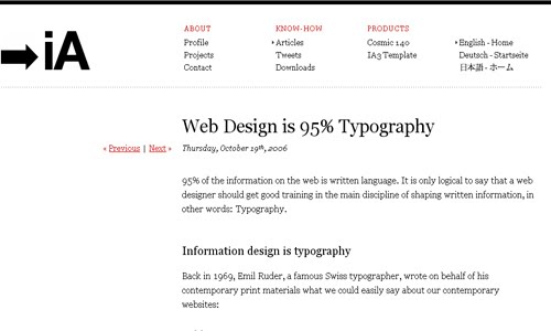
The Anatomy of Web Fonts
If one aspect of design has suffered most in its transition to the Web, it is the art of typography. For years, Web typography involved little more than choosing a typeface and font size. Unstyled Times New Roman was the norm, and the integration of established typographical techniques and rules was unimagined.
10 Principles For Readable Web Typography
A Guide to Web Typography. The Basics: contrast, size, hierarchy, space
Typography for the Web has come a long way since Tim Berners-Lee flipped the switch in 1991. Back in the days of IE 1.0, good web typography was something of an oxymoron. Today things are different. Not only do we have browsers that support images (gasp!), but we have the opportunity to make our web pages come to life through great typography.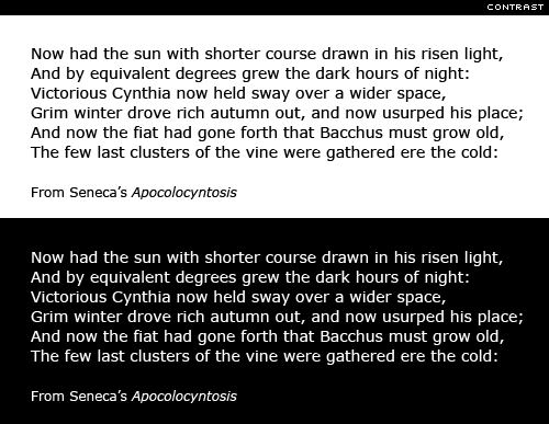
The Myth Of 'Web-Safe' Fonts
The pervasive myth of ‘web-safe’ fonts asserts the existence of a small set of font families that are present on almost all computers. A belief in this myth has led to the widespread adoption by web authors of typefaces such as Verdana, without the precautions necessary to ensure that content remains readable for visitors who don’t possess these fonts. Fortunately Cascading Stylesheets (CSS) provide a solution, allowing authors to specify ‘font family stacks’ to increase the likelihood of a satisfactory appearance. 
8 Detailed Typography Tips for the Web
One of the most under–rated elements of beautiful Web design is the subtle art of typography. Part of this, I know, is a lack of a solid font support for Web sites. But never fear! Today I’ll show you some quick things you can do to appear to be a type master.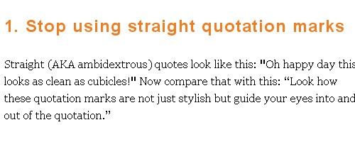
11 Essential Tips for Good Print Typography
Typography is a huge part of design and design is a huge part of type. You can’t just throw text on a page, it has to be laid out and organized in a clean way that adds to the information being presented. Here are 11 typography tips to help you convey information in print the right way.
The 100% Easy-2-Read Standard
Most websites are crammed with small text that’s a pain to read. Why? There is no reason for squeezing so much information onto the screen. It’s just a stupid collective mistake that dates back to a time when screens were really, really small. So… 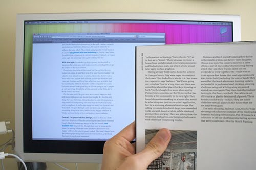
10 Common Typography Mistakes
The goal of this post is to help designers and clients understand the importance of good type skills, while avoiding some of the common mistakes. Please keep in mind that most of these mistakes are subjective and can be changed varying on the project, goals or circumstances.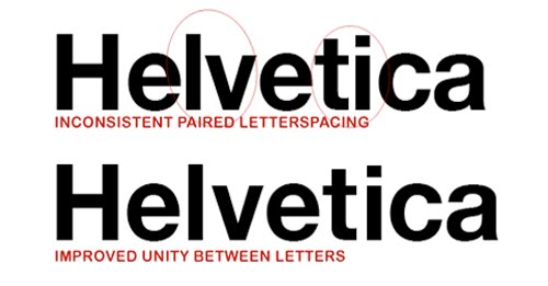
CSS Typography : The Missing Manual
Typography is often overlooked in todays design specifically by web developers. It really is a shame because CSS gives us so much control over our type. That being said, we our limited to certain “web safe” typefaces but that shouldn’t decrease our creativity. Here are a few CSS tips for typography on the web.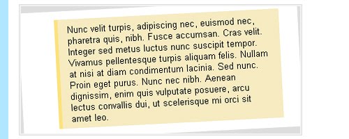
No comments:
Post a Comment